The Great Storm of 15–16 October 1987 helped lead to the UK’s National Severe Weather Warning Service and improvements in forecasting. Its practical legacy is a warning system that communicates possible disruption, not just wind strength. Thirty-nine years later, the useful question is how to read that information: today’s warning colour combines the expected impact with the likelihood of it happening.
The anniversary recalls an exceptionally destructive storm across southern Britain, with 18 deaths in the UK according to the Met Office’s historical account. Regional retrospectives, including Sussex Express’s anniversary photographs, revisit damaged homes and landscapes. The agency’s current guide adds a fresh reason to examine the legacy: it notes an October 2026 update harmonising the warning and flood-guidance impact matrices.
A forecast gap became a warning-system lesson
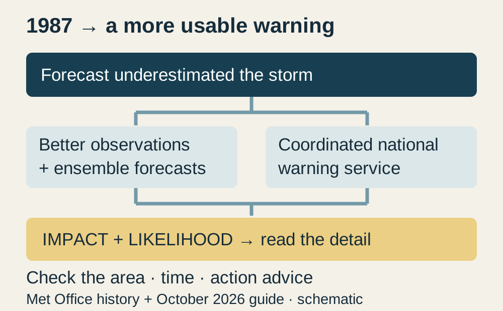
The Met Office describes a rapidly developing low near the Bay of Biscay whose eventual track brought severe winds farther into populated southern England than the forecast had suggested. The scientific problem was not resolved simply by changing a television phrase. Better observations, finer modelling and later research into the storm’s intense winds all mattered.
The response also changed communication. The agency traces the coordinated national warning service to the storm’s aftermath; it dates the move to impact-based warnings to 2011. Richer observations and ensemble forecasts now explore multiple possible outcomes. More information improves anticipation while leaving a range of possibilities: a forecast is an assessment, not a guarantee of what every street will experience.
What a warning colour can—and cannot—say
A yellow warning can cover relatively likely disruption or a less certain event with more serious potential effects. The same colour therefore does not describe one fixed severity. The October 2026 guide says the impact matrix and some impact-level terminology have changed as weather and flood guidance are harmonised. Readers should use the current warning’s detail rather than an old diagram circulated without its date.
Amber indicates a greater likelihood of disruptive impacts and a reason to consider changing plans. Red signals dangerous weather requiring action; the Met Office advises avoiding travel where possible and following emergency-service and local-authority advice. These are UK warning meanings. They should not be transferred to another country’s alert system merely because its map uses similar colours.
Turn the warning into a decision about your journey
Open the official UK warnings page linked below, choose the relevant day and select the warning area. Read the affected locations and timing, then the expected impacts and advice. The Further details panel contains the impact-and-likelihood matrix. For a journey, match both ends and the route to the warning period; the headline colour is the starting point for that check, not its conclusion.
The lesson of 1987 is therefore both scientific and practical: improving the forecast matters, and making its consequences usable matters too. An anniversary account does not predict another storm today. What it offers is a better way to interpret the next warning—identify the possible disruption, understand the uncertainty and use the stated area and time to decide what to change.
The Met Office historical account, current warning guide and official category explanation were read directly. The national service after1987 and the2011 move to impact-based warnings are distinct steps. The guide records an October2026 matrix update. This historical explanation is not an active storm warning, and UK meanings are not applied to US alerts. Original editorial diagram.
- Met Office: lessons and legacy of the Great Storm of 1987 ↗
- Met Office weather warnings guide, updated October 2026 ↗
- Official UK warnings map and details ↗
- Sussex Express: 39th anniversary of the Great Storm ↗
- Met Office: how warnings are categorised; impact-based warnings since2011 ↗